This is the course notes I took when studying Introduction to Operations Management, offered by Wharton on Coursera.
The four dimensions of operational performance are:
- Cost: the efficiency of the operations;
- Quality:
- performance (product) quality (how good?)
- comformance (process) quality (as good as promised?)
- Variety: customer heterogeneity;
- Time: responsiveness to demand.
These four dimensions are important for 1) performance measurement and 2) defining a business strategy. Strategy guru, Michael Porter, suggested there are two ways in which an organization can get a competitive advantage: either through cost leadership or through differentiation. The dimensions that we discussed – variety, quality and timeliness – are three ways in which your operation can differentiate itself from others.
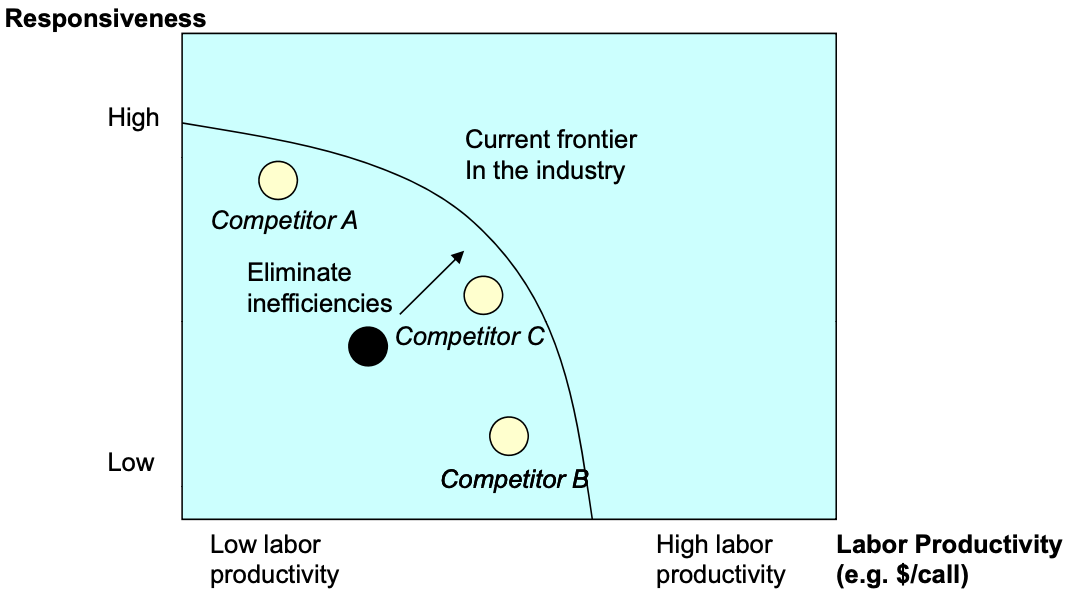
Ideally, as a business, we want to excel at all four areas. However, it is not possible as some goals, such as labor efficiency and responsiveness, are conflicting. Thus, we need to make tradeoffs. If we draw the performance metrics of two dimensions on a graph for all industry players, and the highest level of the efficiency frontier of the current industry, and the difference between a firm with the efficiency frontier is the inefficiency. By redesigning the process, it is possible to improve beyond the current efficiency frontier, and the firm gains a competitive advantage over the industry.
Process Analysis
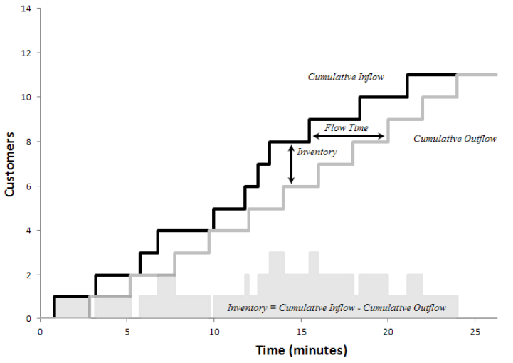
First we discuss three most important performance measures of an operation, flow rate (also known as throughput), inventory, and flow time. They are defined as follows:
- Flow rate / throughput: number of flow units going through the process per unit of time;
- Flow Time: time it takes a flow unit to go from the beginning to the end of the process;
- Inventory: the number of flow units in the process at a given moment in time;
- Flow Unit: an atomic unit of analysis, e.g., customer for a restaurant.
If we draw the cumulative inflow and outflow of a process on the same graph, the flow time is the horizontal difference between the two lines, and inventory is the vertical difference between the two lines.
Note that “inventory” would show up in an accounting balance sheet if the flow unit is goods under production. It will not show up if it is to measure services. Inventory takes up more than 1 trillion dollars on the balance sheet of US companies in the manufacturing sector. Inventory happens whenever you have mismatches between supply and demand.
Bottleneck
The processing time or the activity time is the time taken for a flow unit to go through an activity (“how long does the worker spend on the task?”). It is expressed in unit of time per flow unit.
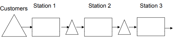
Process flow diagram visualizes the process with
- triangles standing for flow units waiting;
- arrows capturing the flow of the flow units;
- boxes capturing the resources that carry out the activities in the process flow.
Capacity is \(1/\text{processing time}\). It answers “how many units can the worker make per unit of time?” If there are \(m\) workers at the activity, then \(\text{capacity} = m/\text{processing time}\).
Bottleneck refers the the process step with the lowest capacity (or highest processing time). Process capacity is the capacity of the bottleneck. Note that even the bottleneck can have excess capacity when there is insufficient demand. So the flow rate is the minimum of demand rate and process capacity. The utilization is \(\frac{\text{flow rate}}{\text{capacity}}\) which is 1 if demand equals to or exceeds capacity.
Labor Productivity
The processing time for activities in a process vary, and labor have idle time. We want to measure the labor productivity.
Cycle time is \(CT=1/\text{flow rate}\). It measures how much time passes between the completion of two subsequent flow units. Direct labor content is the sum of all processing times. If one worker is staffed at each activity, the direct idle time is the sum of difference between cycle time and processing time.
\(\text{Average labor utilization}=\frac{\text{labor content}}{\text{labor content}+\text{direct idle time}}\) \(\text{Cost of direct labor}=\frac{\text{total wages per unit of time}}{\text{flow rate per unit of time}}\)
While labor costs appear small at first, they are important if we roll up costs throughout the value chain (you are paying for your suppliers’ labor) and they are relative to the value added.
Little’s Law
Little’s Law states that the average inventory I is equal to the average flow rate R times the average flow time T. The implications are
- Out of the three fundamental performance measures (I, R, T), only two can be chosen by the management.
- If we hold throughput constant, reducing inventory is equivalent to reducing flow time.
- Given the two of the three measures, we can solve for the third.
Note that Little’s Law deals with averages, which can be misleading as actual values vary from the averages.
Inventory Turns
From Little’s Law, the flow rate \(R\) is COGS (cost of goods sold). We can compute inventory turns as
\[\text{Inventory turns}=\frac{\text{COGS}}{\text{Inventory}}\]Note to use COGS instead of revenue when computing inventory turns, as the margin of the company has no impact on inventory turns. Inventory turns measure how efficient the company uses its working capital.
There is a cost of capital (borrowing), storage, and obsolescence (goods decrease value over time), called annual inventory costs, expressed as a percentage of the inventory. We can compute the per-unit inventory cost by dividing (annualized) inventory turns into annual inventory costs. This is the cost of holding inventory.
\[\text{Per unit inventory cost}=\frac{\text{annual inventory costs}}{\text{inventory turns}}\]In most businesses, higher inventory turns has a very significant impact on the bottom line.
Reasons for Inventory
So inventory has a cost, why do companies hold inventory? As the flow rate is the minimum of demand and capacity, both of them can vary greatly. There is a saying called “buffer or suffer”: if a system is not able to buffer the variability of demand or capacity, it will suffer a loss of flow rate. Inventory acting like a buffer, helps us with the flow rate by decoupling the supply and the demand.
Buffering is easier in production settings than in services. In services, there are two strategies, make to order (inventory is order) and make to stock (inventory is services). Make-to-Stock advantages include:
- Scale economies in production
- Rapid fulfillment (short flow time for customer order) Rapid fulfillment (short flow time for customer order)
Make-to-Order advantages include:
- Fresh preparation (flow time for the sandwich)
- Allows for more customization (you can’t hold a t hold all versions versions of a sandwich in stock)
- Produce exactly in the quantity demanded
We have five reasons for inventory:
- Pipeline inventory: you will need some minimum inventory because of the flow time > 0. This is the direct reason from Little’s Law.
- Seasonal inventory: driven by seasonal variation in demand and constant capacity.
- Cycle inventory: economies of scale in production (purchasing drinks).
- Safety inventory: buffer against demand (McDonald’s hamburgers).
- Decoupling inventory/buffers: buffers between several internal steps.
Multiple Flow Units
A system often deals with multiple flow units. Finding the bottleneck in such a system requires new methods.
One method is to compute
- the capacity of each resource;
- the demand from each flow unit at each resource;
- the sum of demand of each resource;
- the “implied utilization” by capacity/demand. The resource with highest implied utilization is the bottleneck.
Another method is to convert flow units into a generic flow unit of “minute of work” and compute capacity and demand accordingly.
Process with Attrition Loss
In many processes only a percentage of items go from one activity to another, due to filtering, production defects, etc. We should compute the demand for each step in the process as it goes through and the (implied) utilization to determine the bottleneck.
Productivity
Productivity is units output produced divided by input used. For example, labor productivity is number of units (output) per hour (labor time as input). Waste and inefficiency, as measured as the distance to the efficiency frontier, reduces productivity.
Waste
- Overproduction: to produce sooner or in greater quantities than what customers demand.
- Overproduced items need to be stored (inventory) and create further waste;
- Bad for inventory turns;
- Products become obsolete / get stolen / etc.
- Transportation: unnecessary movement of parts or people between processes.
- Rework: repetition or correction of a process.
- Rework is failure to meet the “do it right the first time” expectation;
- Can be caused by methods, materials, machines, or manpower;
- Requires additional resources so that normal production is not disrupted.
- Over-processing: processing beyond what the customer requires.
- May result from internal standards that do not reflect true customer requirements;
- May be an undesirable effect of an operator’s pride in his work.
- Motion: unnecessary movement of parts or people within a process. “Moving is not working.”
- Inventory: number of flow units in the system.
- Waiting: underutilizing people or parts while a process completes a work cycle.
- The flow unit waits for a resource.
- The resource can wait for the flow unit in the form of idle time.
KPI and KPI Tree
Productivity improvements can lead to improved finance. Big financial reward often happens in organizations with high fixed costs for even small productivity improvements. Finding out what areas in an operations will lead you to the biggest financial rewards is a key skill.
Key Performance Indicators (KPI) are factors that drives the profitability of the business. It creates the starting point for sensitivity analysis that would formally let us identify those operational variables that yield the biggest financial improvements. KPI trees are powerful ways to visualize the relationship between the many operational variables and the financial bottom line.
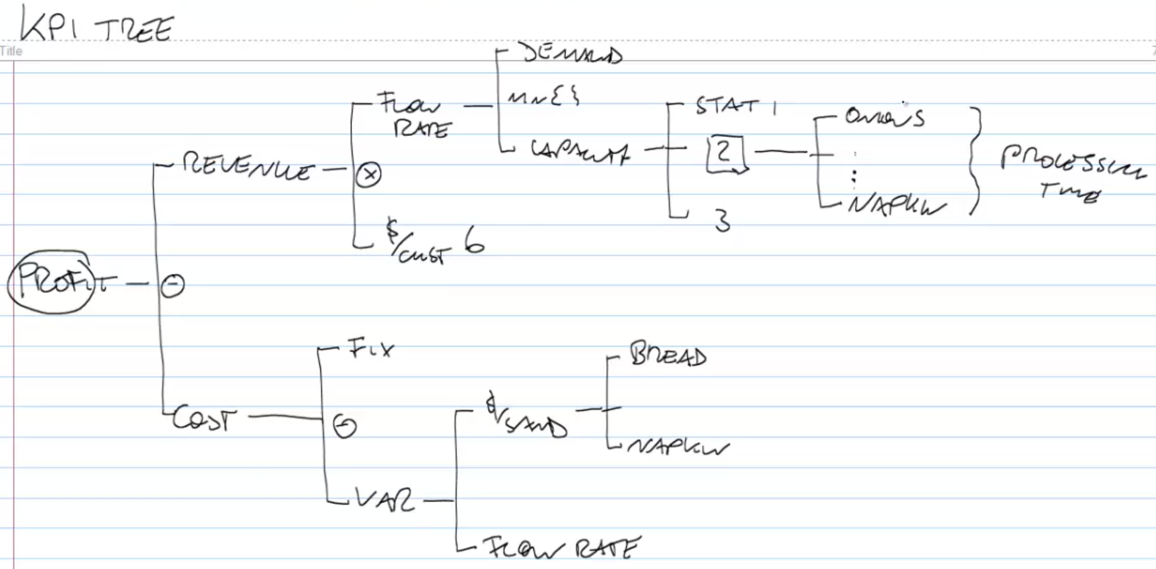
KPI tree starts with revenue and cost and recursively iterate through all factors in the operation that contribute to revenue or cost. The KPI tree for Subway is shown above.
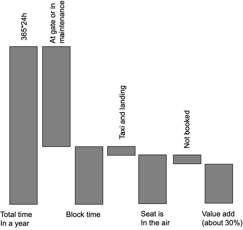
Overall Equipment Effectiveness
The overall equipment effective framework, or OEE framework for short, counts all the time that you have available on a resource. The resource can be people or machinery. It starts with a timeframe (e.g., a year, a month), and then identifies all these things at the resource that are waste. By taking these pieces out of the available time, you are left with the time that the resource is really productive. This is the overall equipment effectiveness. It’s a fraction of time that the resource is adding value.
For example, the OEE of an aircraft is shown below.
Takt Time
One of the most obvious forms of capacity wastage is idle time, which happens due to bottleneck and lack of demand.
Takt time is the average time between the start of production of one unit and the start of production of the next unit, when these production starts are set to match the rate of customer demand. “Takt” is a German word which stands for the beat of the music. The target manpower is the round-up of division between labor content and Takt time.
Line balancing is about sharing the work equally among the resources in the process.
- Determine Takt time.
- Assign tasks to resource so that total processing times < Takt time.
- Make sure that all tasks are assigned.
Then to minimize the number of people needed. Small processes can do this through try-and-error.
Capacity tends to be fixed, while demand changes often over time. This leads to temporary mismatches between supply and demand. To staff to demand:
- Estimate your demand over time.
- Level the demand at a coarser time unit because one cannot change staffing minute by minute.
- Calculate the Takt time and target manpower for each time period.
- Design a process to move effectively between different staffing.
Quartile Analysis
In practice, the variation of processing times across workers impact the overall operational performance. The idea of quartile analysis is to compare the processing time between the top \(x\)%-tile and the bottom \(x\)%-tile. Reducing these productivity gaps between the top quarter and the bottom quarter employees provides an enormous financial opportunity. Typically, if we can transfer the best practices from the top performers to the bottom performers, the average productivity is going to be lifted upwards. This is the idea behind standardization.
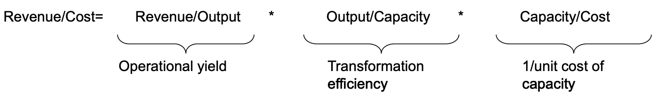
Productivity Ratios
Productivity is defined as Output units produced / Input used. Output is hard to measure. Often times we use revenue instead. There are multiple input factors, such as labor, material, capital, and we often use one category.
We can break the productivity ratio into multiple terms, each representing one aspect of the operation. For example.
In general you can take two approaches. First, look top-down. Start from the finance, work yourself down into the operations using tools such as a productivity ratio, and compliment this with observational data from the front line. Second is bottom-up. Look at the operational data and aggregate them using the tools, such as the KPI tree, to look how they are driving financial performance. This is where you get a balanced view of your productivity in the operation.
Quality
There are two dimensions of quality.
- Performance quality, which measures to what extent a product or service that we’re providing is meeting customer expectations.
- Conformance quality, which measures whether the process is carried out the way that we intend it to be carried out.
We focus on conformance quality. Variability is the root cause of the complexity. Without variability, we either perform the process correctly all the time, or wrongly all the time.
Each activity in the process has a yield which is 1 minus the probability of detect. Then the yield of the process is the product of yield of each activity. This requires every step of the process is carried out according to specification.
Some processes have built in redundancy so they can afford that step in the process is carried out with a defect and still the overall quality of the output is acceptable. This is known as the Swiss Cheese Model (Swiss cheese has holes in it; by stacking multiple slices together it is less likely to have holes through all of them). The probability of defect with multiple redundancies is the product of the defect probability of each redundant step.
Quality Impact on Flow
Steps that have the possibility of creating defects must be captured in the process flow diagram. They can either take the form of scrapping the flow unit, which means we just drop it from the flow, or re-working the flow unit, which means repeating some of the operations that has happened before the defect. Either way, defects show up in the process flow diagram and have the potential to make a resource bottleneck that without these defects would not be a bottleneck.
There are multiple ways of reasoning about the process flow:
- Compute the actual processing time of steps with detects. A scrapping rate of \(p\) increases the processing time from \(t\) to \(\frac{t}{1-p}\), and a reworking rate of \(q\) increases the processing time to \((1-q)t+2qt\).
- Compute the implied utilization from the last step to the first step by assuming a demand of \(D\). A scrapping rate of \(p\) increases the demand to \(\frac{D}{1-p}\), and a reworking rate of \(q\) increases the demand to \((1+q)D\).
Defects creates variability, and either rework or scrapping results in stranded capacity. Again this is the idea of buffer or suffer. However, inventory takes pressure of the resources and thus hiding the underlying problem. Thus, by reducing inventory, problems are exposed instead of hidden.
A Kanban System that uses a Kanban card to authorize work creates a demand pull. Instead of every step working as hard as possible, work is only authorized when a Kanban card arrives. Amount of work-in-progress is determined by number of cards, thus capping the inventory.
Six Sigma
Often the matter of good or bad is not as binary as it sounds. Oftentimes, there’s an underlying parameter that can be measured, be it a geometry, a weight, or a temperature, and this underlying measurement has to be compared with some specification. Generally, the specification is defined as a range between \(LSL\) (lower specification limit) and \(USL\) (upper specification limit).
The capability score is defined as (\(\hat{\sigma}\) is standard deviation):
\[C_p=\frac{USL-LSL}{6\hat{\sigma}}\]The higher the capability score is, the lower the probability of defect is. Probability of defect is often measured by ppm (parts-per-million), by simply multiplying the probability by 1 million. Assuming a normal distribution of variability, when \(C_p=2\) (i.e., LSL/USL is \(6\hat{\sigma}\) from the mean) the defect rate of ppm is 0.
Control Charts
Control charts help us to distinguish between what we would call as normal and abnormal variation. There are two types of variations:
- Common cause variation happens when flow units go through the identical process;
- Assignable cause variation happens between changes in the process.
To identify assignable cause variation, we should establish control limits. Common cause variation falls within the control limits while assignable cause variation is outside of the control limits.
Control limits are different from specification limits. Control limits are established from 3 times the standard deviation of the sample count.
Control charts is a part of a broader toolbox known as statistical process control. Statistical process control is a never-ending cycle of the following steps:
- Capability analysis: what is the current “inherent” capability of my process when it is “in control”?
- Comformance analysis: identify when control has likely been lost and assignable cause variation has occurred.
- Investigate for assignable cause: find “root cause(s)” of potential loss of statistical control.
- Eliminate or replicate assignable cause: need corrective action to move forward.
Jidoka
Catching defects quickly is critical. There are at least two reasons for that.
- We’ll see that defects often lead to further defects, especially if there is a lot of inventory in the process.
- If we have a defect in the process, it’s critical that we catch it before it moves to the bottleneck, because otherwise, scarce bottleneck capacity is wasted on the defect.
Inventory leads to a longer ITAT (Information turnaround time) as the following step won’t detect the defect until previous inventory is processed, thus leading to slow feed-back and no learning.
The cost of the defect depends on the step where the detect is identified, not occurred. If the defect is identified before the bottleneck, the cost is COGS; if the defect is identified after the bottleneck, then the cost is the opportunity cost of the lost revenue. Thus, it is important to test the flow unit before going into the bottleneck.
Jidoka means if an equipment malfunctions or gets out of control, it shuts itself down automatically to prevent further damage. It requires the following steps: detect, alert, stop. Andon Cord is a rope to pull to stop the assembly line, and the station number appears on the andon board.
Root Cause Problem Solving
Ishikawa Diagram is a brainstorming technique of what might have contributed to a problem. It shapes like a fish bone. A potential root cause may have sub-root causes, so a famous technique is 5-Why’s. It keeps asking “why something happened?”
Then the number and frequency of assignable causes identified in the Ishikawa diagram is mapped out in decreasing order, and a cumulative probability line is drawn. This is known as the Pareto Chart. Often we will find that 80% of the issue was caused by 20% of the root causes, known as the 80-20 logic or Pareto Principle.
Note that both statistical process control and the Toyota Production System both use iterative problem solving between the reality and the thought process. For example,
- Jidoka (reality) to identify the problem;
- Ishikawa (thought) to analyze the problem;
- Pareto (reality) to gather data for the root cause;
- Alternative solutions (thought) to find mitigations;
- Experiments (reality) to try the solution.
Toyota Production System
Toyota built the Toyota Production System since the 1950s to systematically eliminate waste and build the operations around serving demand.
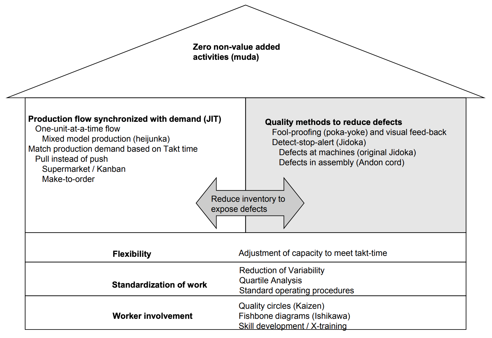
Summary: The Three Enemies of Operations
The three enemies of operations are waste, inflexibility, and variability.
Waste is the use of resources beyond what is needed to meet customer requirements. We discussed “the seven types of waste”, the OEE framework, and lean operations (“do more with less”).
Inflexibility results in additional costs incurred because of supply-demand mismatches.
Variability is associated with longer wait times and/or customer loss. It Requires process to hold excess capacity (idle time or inventory). We discussed the idea of “buffer or suffer”. Often times, variability results in quality issues (“Six Sigma”).